
Did you know that colors can increase your brand recognition by over 80%? Indeed, according to scientific studies, the use of colors allows me to remember more effectively than an image which is in black and white only. In addition, colors attract attention, which is important for your brand marketing strategy.
With that said, it is important to stay consistent and analyze the option before launching your brand. In fact, this will be the first thing that your client is going to notice when they visit one of your pages, first impression matters in the digital world.
The choices of our colors will have a direct impact on the psychology of your audience, which is why having a thoughtful strategy is important. To help you, here is a color guide from a designer’s perspective:
The warm colors:
In this category, warm colors have been shown to trigger emotions and initiate action.
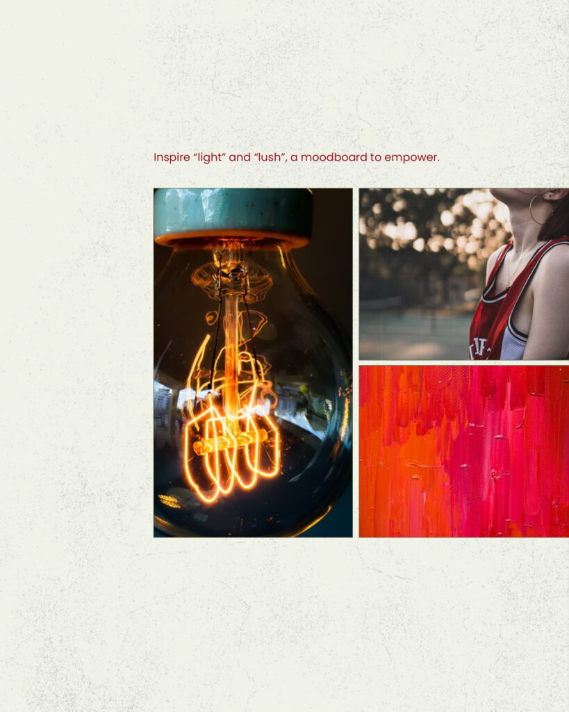
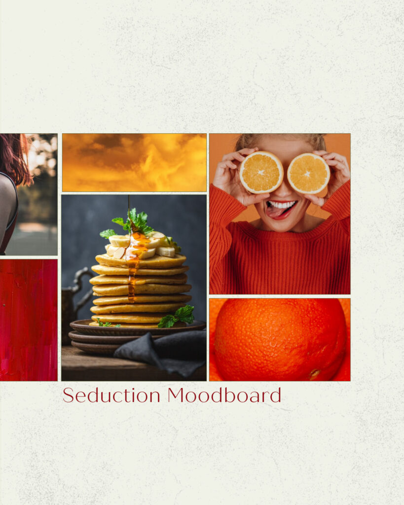
The signification of red :
You probably noticed there are a lot of athletes and restaurants that use red as the main color. Think about Red Bull, Coca-Cola and the Raptors of Toronto. The usage of red is not a random selection. It is proven that red will trigger hunger, suggest power, energy and desire.
The meaning of orange:
When we think of orange, we often think of joy, audacity and fun. This color is less aggressive than red, therefore, more accessible. For example, Nike, Fanta, Master Card and Amazon. Their target audience is general and this color serves them right. Orange is also proven to show trust and adventure, which is why we can often find it the branding of travel agencies.
The meaning of yellow:
Yellow means happiness, light and creativity. However, it is rare that the color is used because it is harder to read with most colors and studies shown that it is the less liked color. Although used in the right way and in complementary, you might stand out from the other brands. A good example is Snapchat.
The cold colors:
The cold colors have the tendency to calm people’s minds.
The meaning of purple:
Spirituality, wisdom and royalty are the main characteristics of purple in the psychology of Colors. It is also related to feminine energy and works really well when it is the target audience.
The meaning of blue:
Studies demonstrate that blue is the most loved and popular color and the majority of brands are using shades of blue. One of the reasons is because it represents loyalty, trust and security. It was not by coincidence that brands such as PayPal, American Express selected that color for their brand identity.
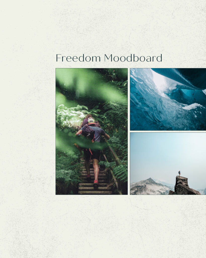
The meaning of green:
You are probably thinking of the environment, health and calmness. On the other hand, it can be associated with luxury and money. Let’s take for example TD Bank and Mint. Research has also shown that the color can help boost creativity and innovation. This explains why it is often used with technology.
The neutral colors:
The meaning of white:
This color suggests simplicity and cleanliness. Think about Apple, which promotes simplicity, but elegance and prestige.
The meaning of black:
It is not uncommon to see luxurious brands use black as their main color. Think about sports cars and high-range perfume. Black creates an illusion of power, sophistication and is highly valued.
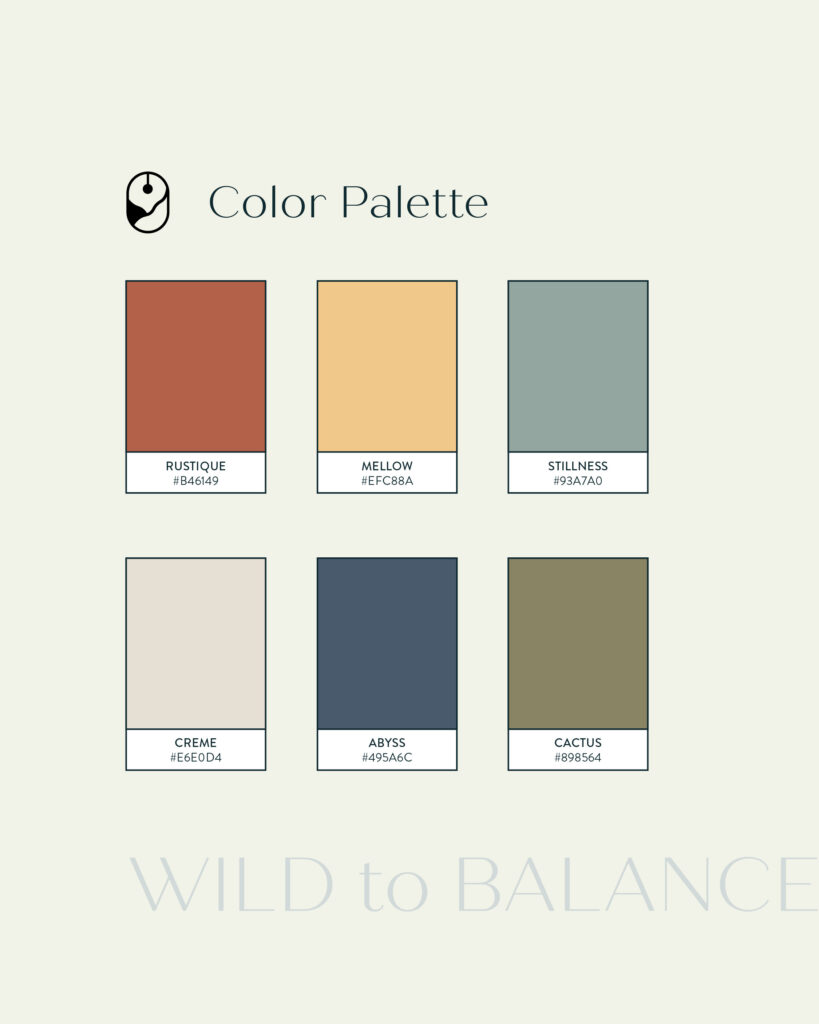
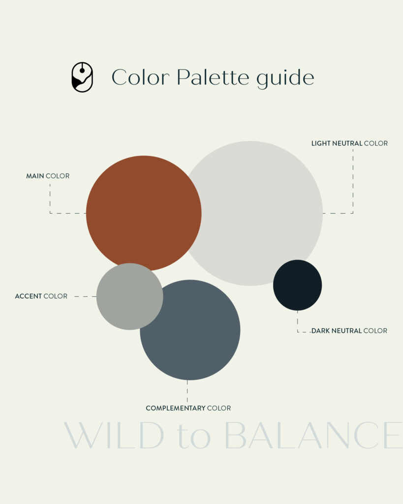
The 5 types of Colors you should consider to have a good visual balance for your brand
Now that you had an introduction to the psychology of colors, it is time to show you how to create a good color palette for your brand. Ask yourself this question: What do you want to communicate? Who is your target audience? What emotions do you seek to trigger?
The vibrant main color: this main color will be used for the call to action to capture the attention of the target audience.
The accent color: an alternative color that mingles with the main color and the complementary color.
The complementary color: It creates the contrast with the main color, to identify it, use achromatic color.
The neutral light color: This tone is used as a background to support the elements and create a deeper field.
The neutral dark color: Similar to the light color, it can be a good alternative for background and texts.
How to choose an efficient color palette for your brand
With these new notions, it is now time for you to make a choice. Know that it is not necessary to use the 5 types of colors to make a brand successful. I suggest to have the opinion of a designer to help you create this strategy. Although, if you want to try on your own, here is a few suggestions:
- Use an achromatique Color to generate quick color palettes.
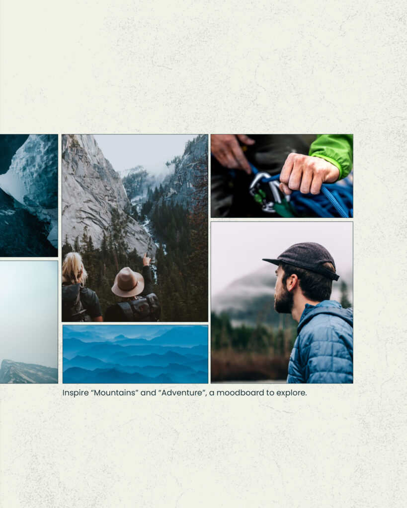
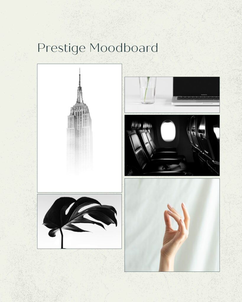
- Do a research on Behance and Pinterest to create a moodboard and find inspiration.
- Do a lot of color tests to compare. The first Idea you have in mind might not be the best.
Finally, a friendly reminder to not skip the fundamental steps because on the long run, you might have to spend a lot of time and energy to recover from the mistakes in the beginning.
For any questions, please don’t hesitate to reach out.